Header & Navigation Redesign
@ASTR The Label

Overview
In this case study, I will outline my process and approach to redesigning the header and navigation of our e-commerce site with the goal of enhancing the overall user experience. The project aimed to address usability issues, improve navigation efficiency, and create a visually appealing and cohesive design.
Background
Duration
10 weeks
Team
Alex Bernier (Lead Technical Architect)
Luis Hoffer (Ecom Director)
Carol An (Product Manager)
My Role
User Interface
User Experience
QA
Tool
Figma
Problem Statement
→ The existing header and navigation suffered from usability challenges, including mega menu for desktop and mobile screens.
→ Header height on desktop screen seems to take too much space on the page
→ Inconsistent layout across devices.
→ Limited functionality.
“We spend a lot time designing the bridge, but not enough time thinking about the people who are crossing it.”
Defining Design Goals
Simplify navigation:
Reduce cognitive load by organizing menu items logically and eliminating unnecessary elements.

Enhance visual appeal:
Create a visually engaging design that aligns with the brand's aesthetics and enhances user engagement.

Mobile first:
Ensure seamless responsiveness across various devices and screen sizes.
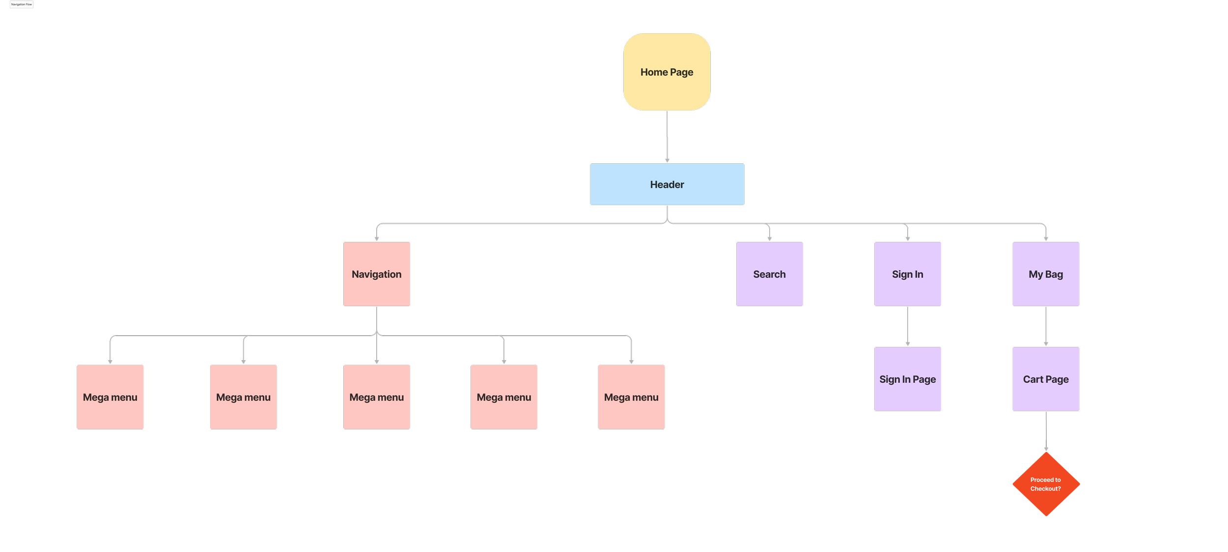
Header/ Navigation Flow
Ideation
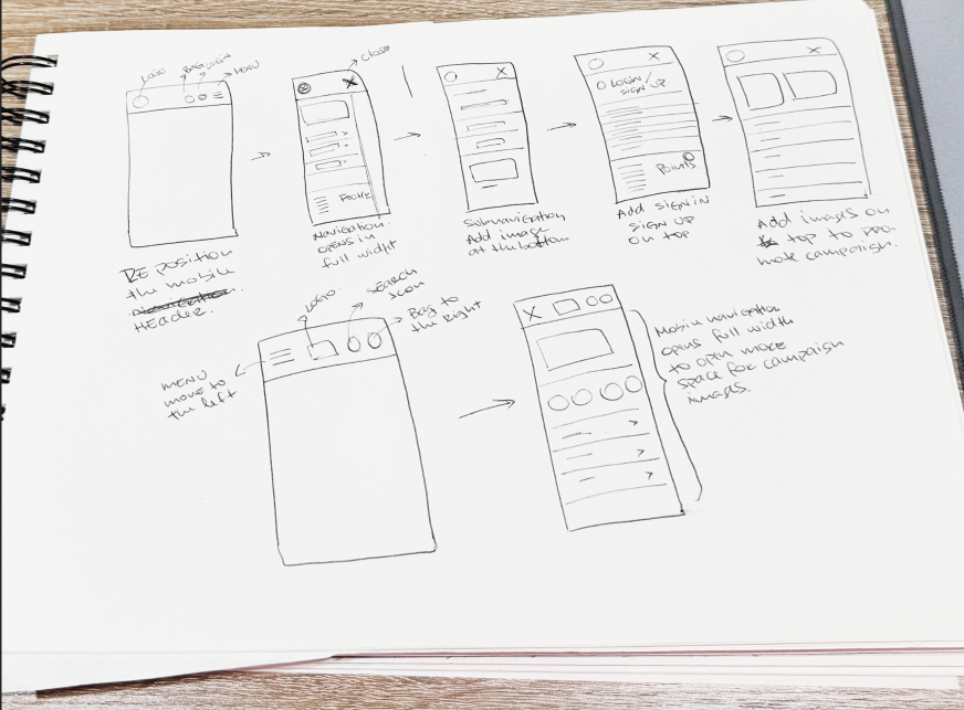
Initial plan was to re-organize the order of the icons on the header.
On the mobile mega menu I wanted to have the opportunity to use some of the empty space to add element that I felt it was missing, such as footer adding links to my account, shipping information, return information, log in, store.
Bring more visual and engage the user with beautiful images for each category section.
Desktop Header
The focus was to combine all element and shorten the height of the header. After trying different layouts I decided to remove the text for the “search”, “sign in” and “bag” just keeping the icons. It gives a cleaner look and take less space on the navigation.

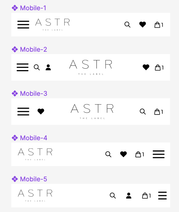
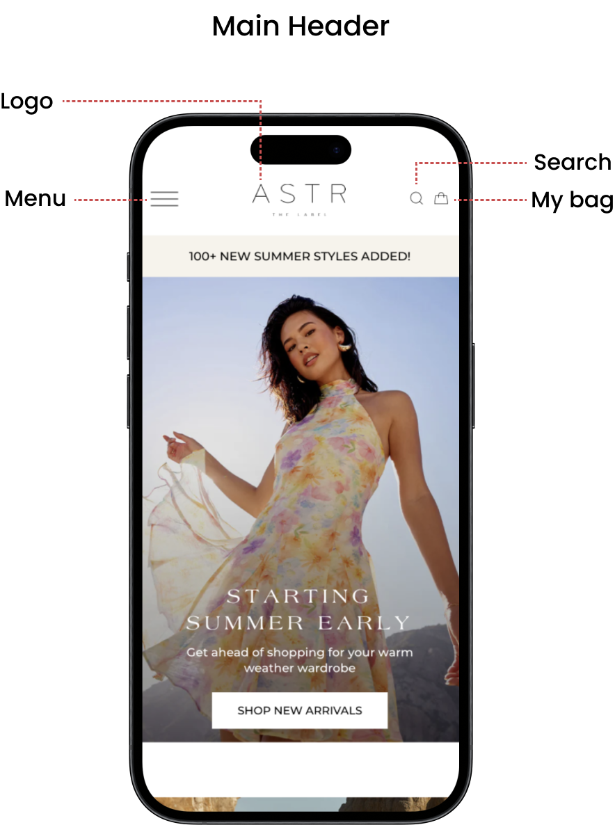
Mobile Header
I was trying different spots for the hamburger menu and also making sure the logo was in a good position. It made sense to move the hamburger menu to the left side and have the bag on the right side since we have the slider cart on the right side. Keeping the logo in the middle also made more sense. I needed to keep the logo big enough to be eligible to read.
Final Header

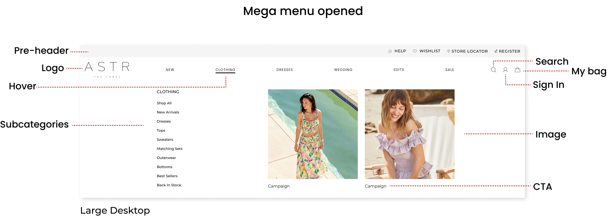
Desktop: Pre-header will be added before the main header where we decided to add links to Help, wishlist, store locator and sign up. Main header will be included the logo main navigation, search icon, sign in icon and bag icon.

Mobile: Hamburger menu will be on the left side, logo will be centered and just keeping the search and bag icon on the right. Sign in and sign up will be placed in the mega menu.
Wireframe
Wireframe process for the mega menu had started after the header was finalized.
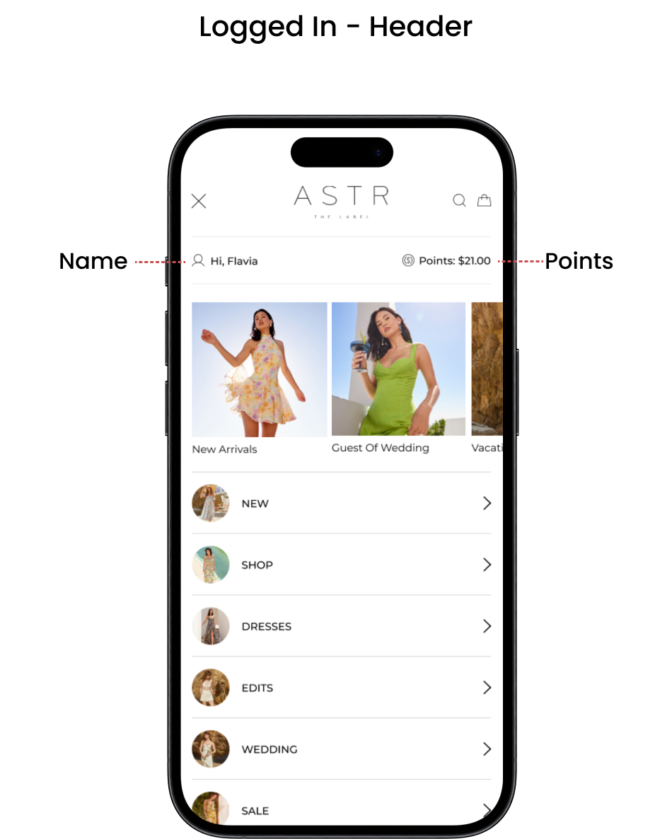
Placing the sign in and sign up link on top of the mega menu is ideal since we would like to encourage the users to sign up and to sign in as they shop.
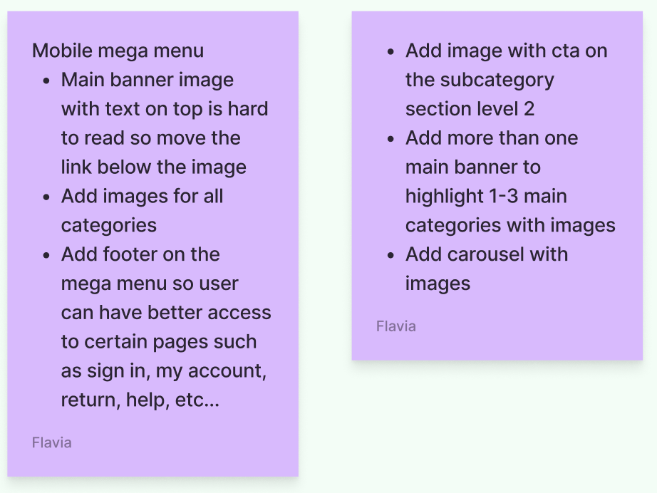
Below the sign in section i am adding three option to highlight the campaign or any category adding image and link to the landing page.
For visual I wanted to add bubbles with image for each category along with the category name
New footer will be implemented on mobile mega menu. We can use the extra space to add links where is easy for the user to access and allocate.
Mobile


Sign in and Sign Up on top of the menu
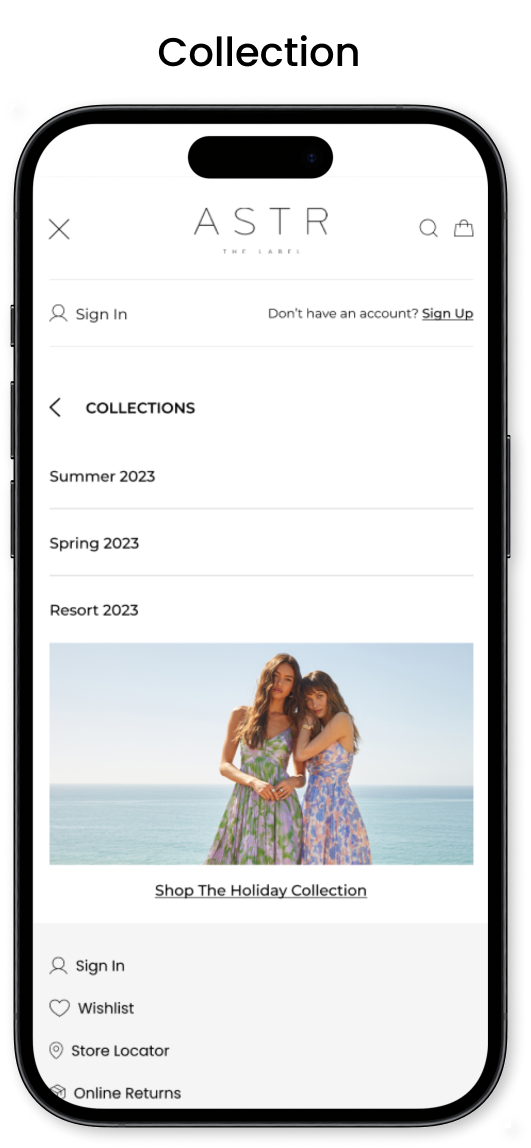
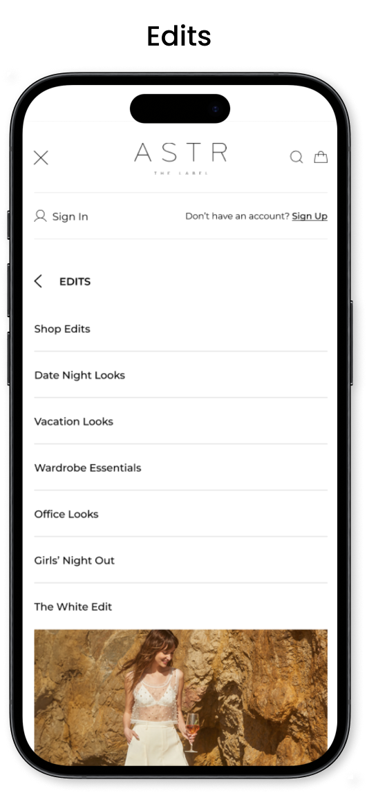
Small category banner linking to the landing page. Three options including 1 banner, 2 banners or 3 banners.

Navigation items will include one circle image, category name and arrow. The arrow will open up to the sub category section (level 2). Under the sub category section will be all the subcategory items and on the bottom one image to highlight one of the categories.

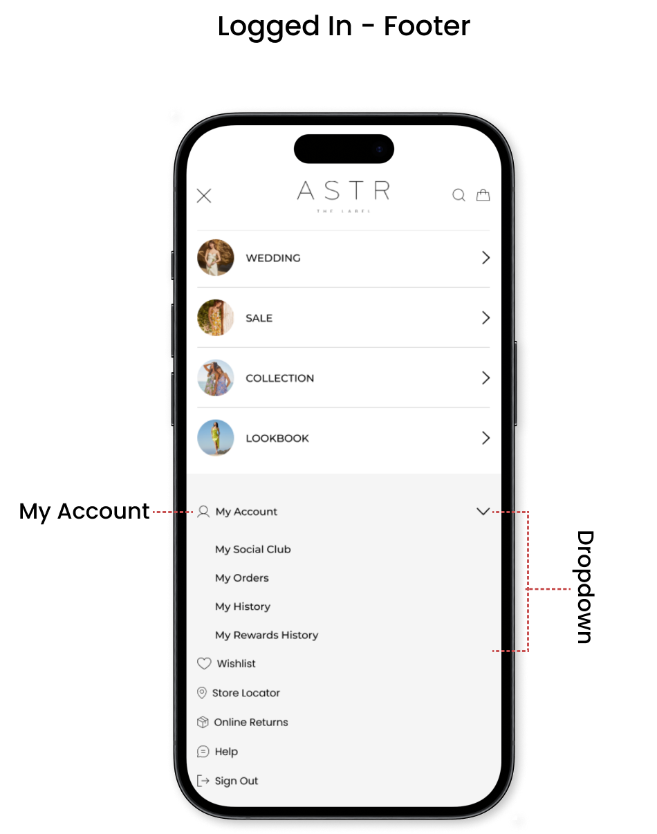
Adding footer on the mega menu will help the users to navigate to sign in, wishlist store locator, online returns, help and sign out. Once the use is logged in they will also have an option to access their account clicking on the dropdown menu.

Desktop

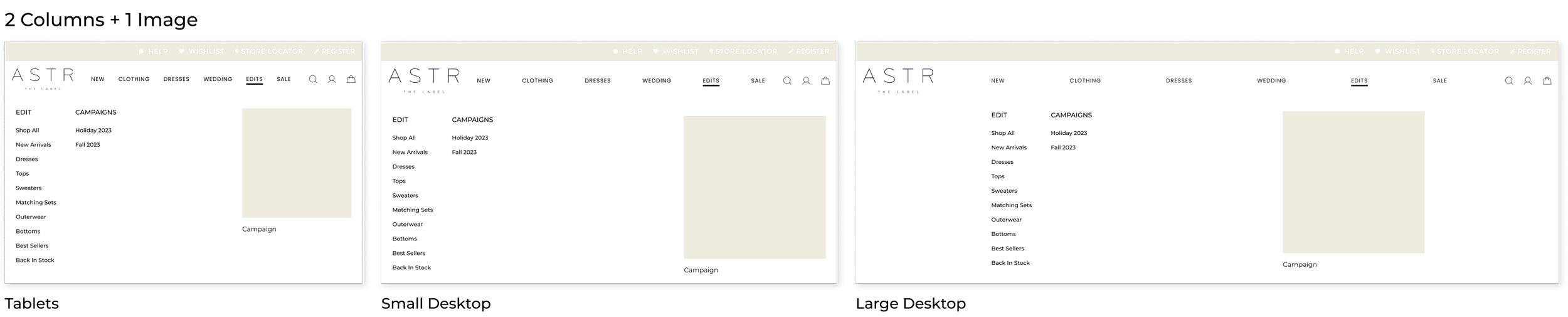

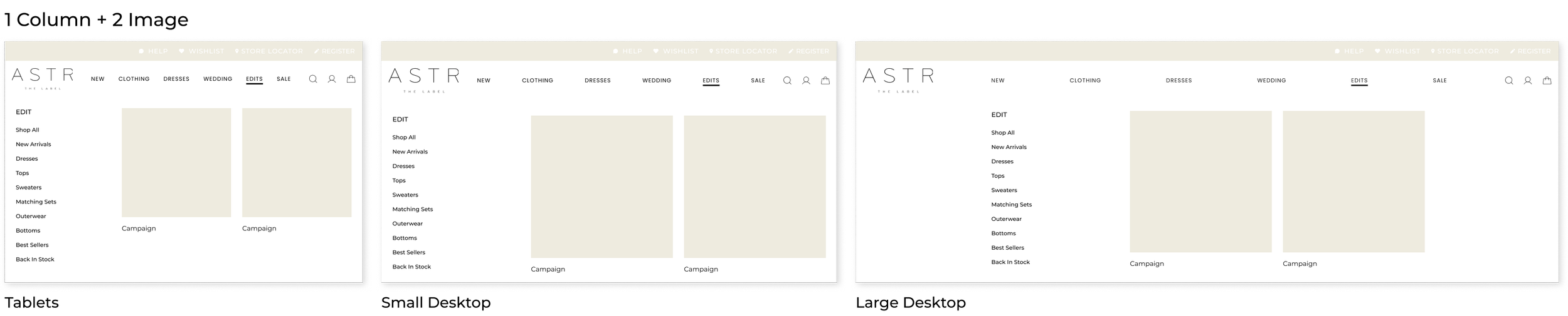
I created different versions of the mega menu where we have the flexibility to include different options such as how many columns do we need or if we can add 1 or 2 images. Ideally all the mega menu will still look very similar and be cohesive to one another.
Final screens - Mobile


Logged In Screens
Subcategories Screens


Final screens - Desktop

Different Screen Sizes
New Features
→ For mobile navigation the user can access to category highlight with images and link to the landing page.
→ Footer section added on the mobile navigation for easier access to my sign in/ sign out, wishlist, store locator, online returns, help and sign up.
→ Images added for each category on the main and sub navigation
Outcome
The redesigned header and navigation were successfully implemented on the website, resulting in measurable improvements in user experience metrics.
Improved navigation efficiency: Users were able to find information more quickly and easily.
Enhanced brand perception: The visually appealing design contributed to a positive perception of the brand among users.
Conclusion
The redesign of the header and navigation was a collaborative effort that focused on understanding user needs, iterative design, and continuous improvement. By prioritizing usability, visual appeal, and accessibility, we were able to create a design that not only met the project objectives but also exceeded user expectations. This case study showcases my skills and expertise in UX/UI design and demonstrates my ability to deliver effective solutions that enhance the overall user experience.