Product List Page Redesign
@ASTR The Label
Overview
In this case study, I will outline the process and approach I took to redesign the product list page of an e-commerce website. The project aimed to improve user engagement, enhance product discoverability, and ultimately increase conversion rates by providing a more intuitive and visually appealing browsing experience.
Background
Duration
8 weeks
Team
Alex Bernier (Lead Technical Architect)
Luis Hoffer (Ecom Director)
Carol An (Product Manager)
My Role
User Interface
User Experience
QA
Tool
Figma
Problem Statement
→ Big image banner takes too much space on the top of the page.
→ SEO copy below the image is too long and it takes some space before the fold of thepage.
→ Add to bag functionality is quick for user to add items in the cart, however they don’t get too much information about the product unless they visit the product page.
Objective
1. Simplify the layout and organization of product listings to improve usability.

2. Enhance filtering and sorting options to help users refine their product search.

3. Optimize the display of product information to facilitate informed decision-making.

4. Create a visually engaging design with images that encourages user interaction.

Defining Design Goals
Improve usability:
Simplify navigation and make it easier for users to find relevant products.

Enhance filtering options:
Provide users with more robust filtering and sorting features to refine their search.
Increase engagement:
Create a visually appealing design that encourages users to explore product listings and interact with the site.

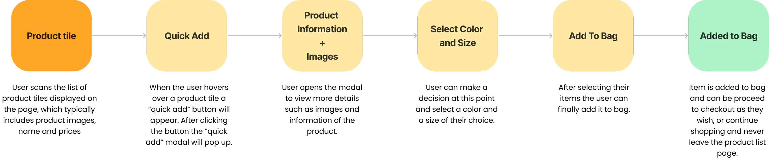
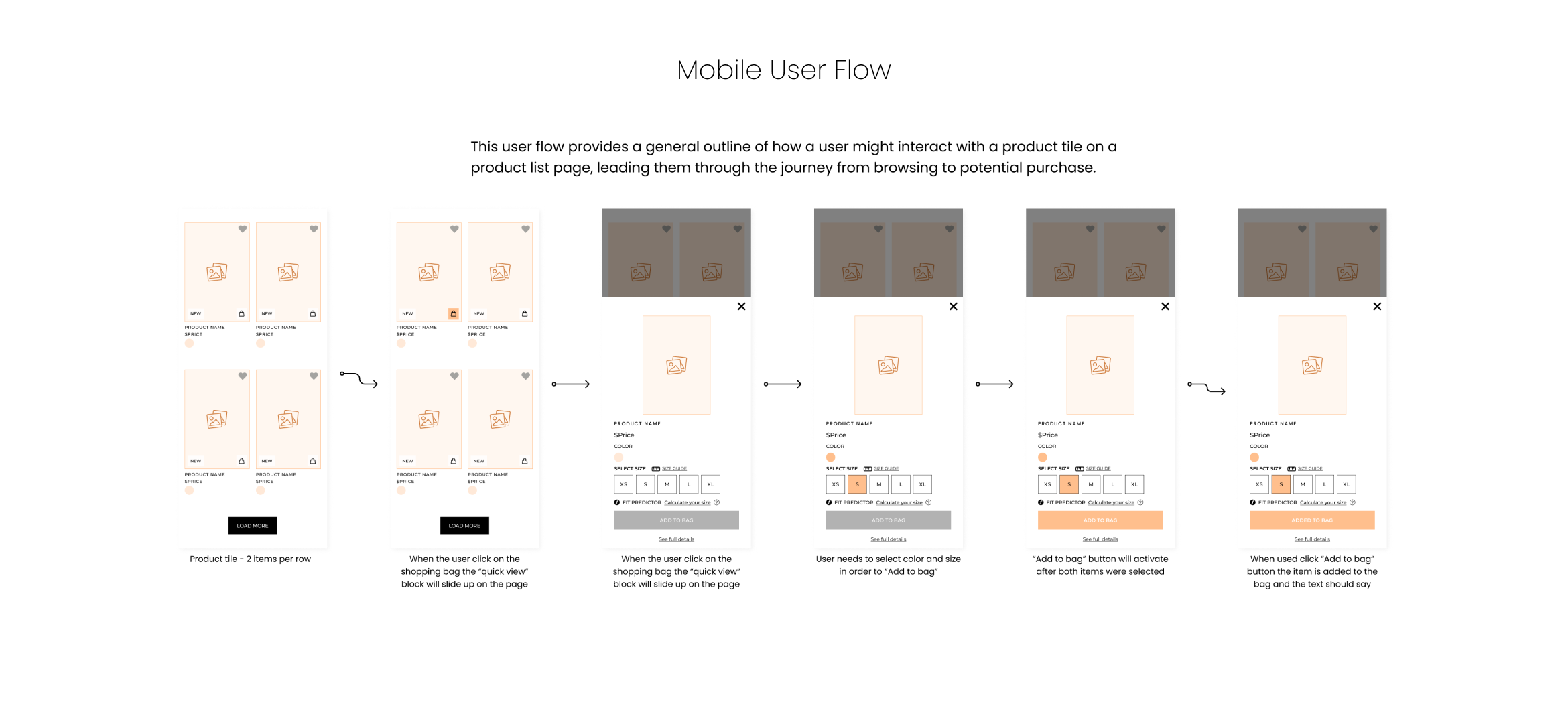
Product Tile Flow
Here's a basic user flow for interacting with a product tile on a product list page:
Ideation & Wiraframing
Generated multiple design concepts through sketching and rapid prototyping.
Created low-fidelity wireframes to explore different layout options and information hierarchy.
Iterated on wireframes based on feedback from stakeholders and usability testing.
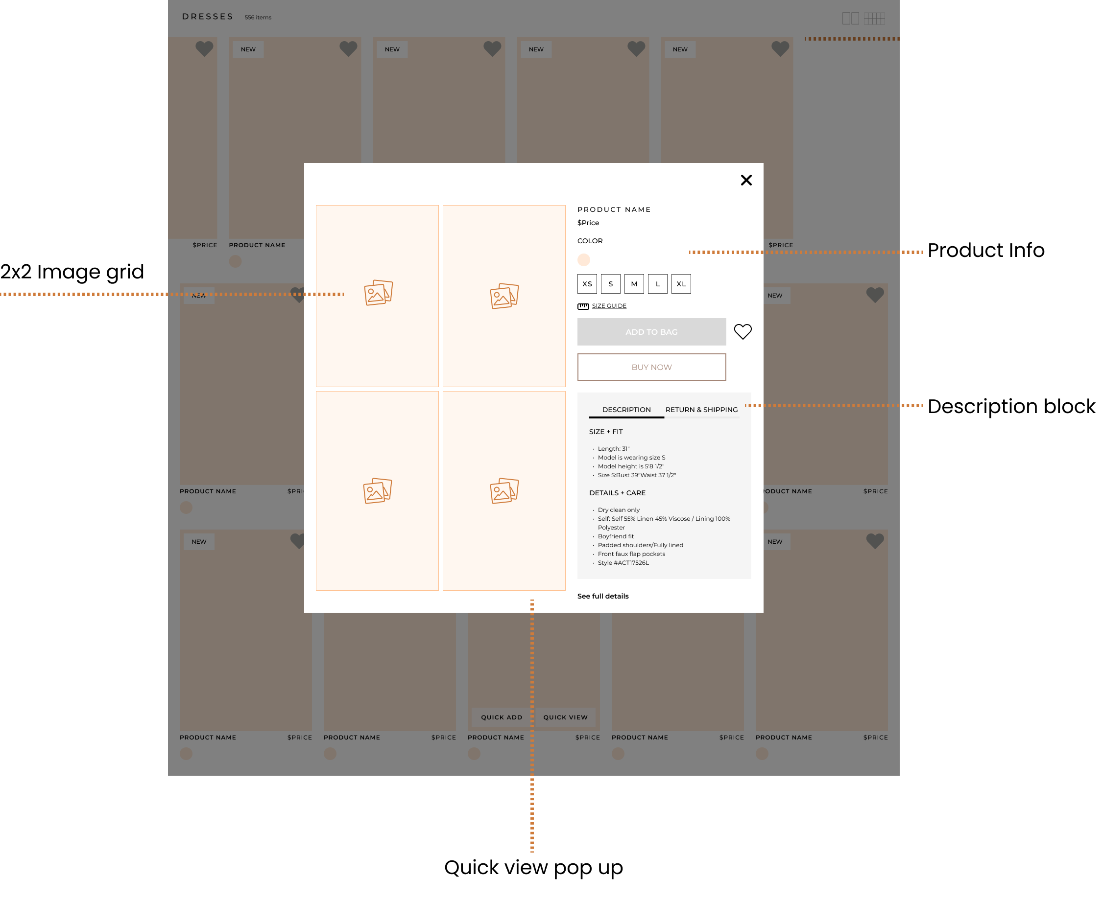
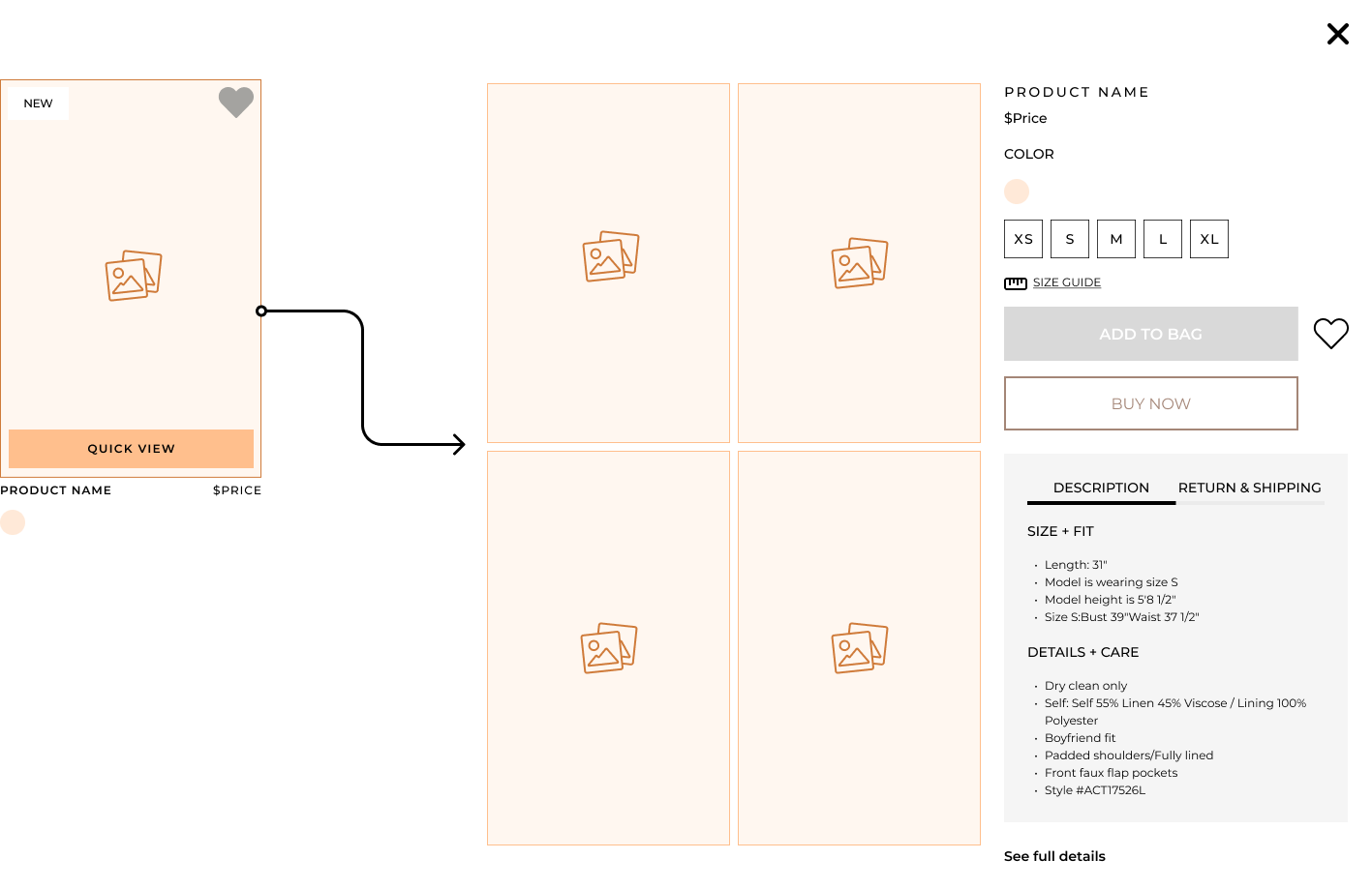
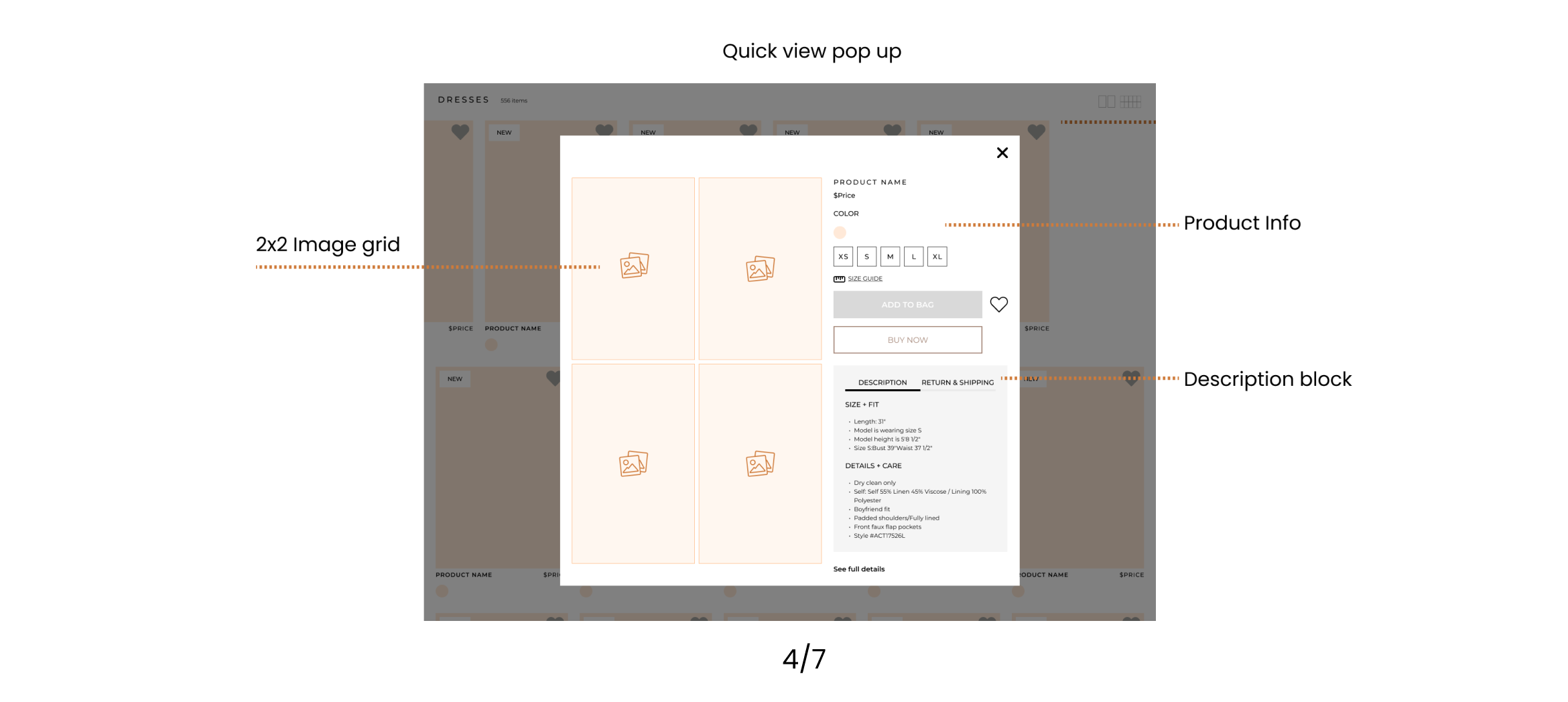
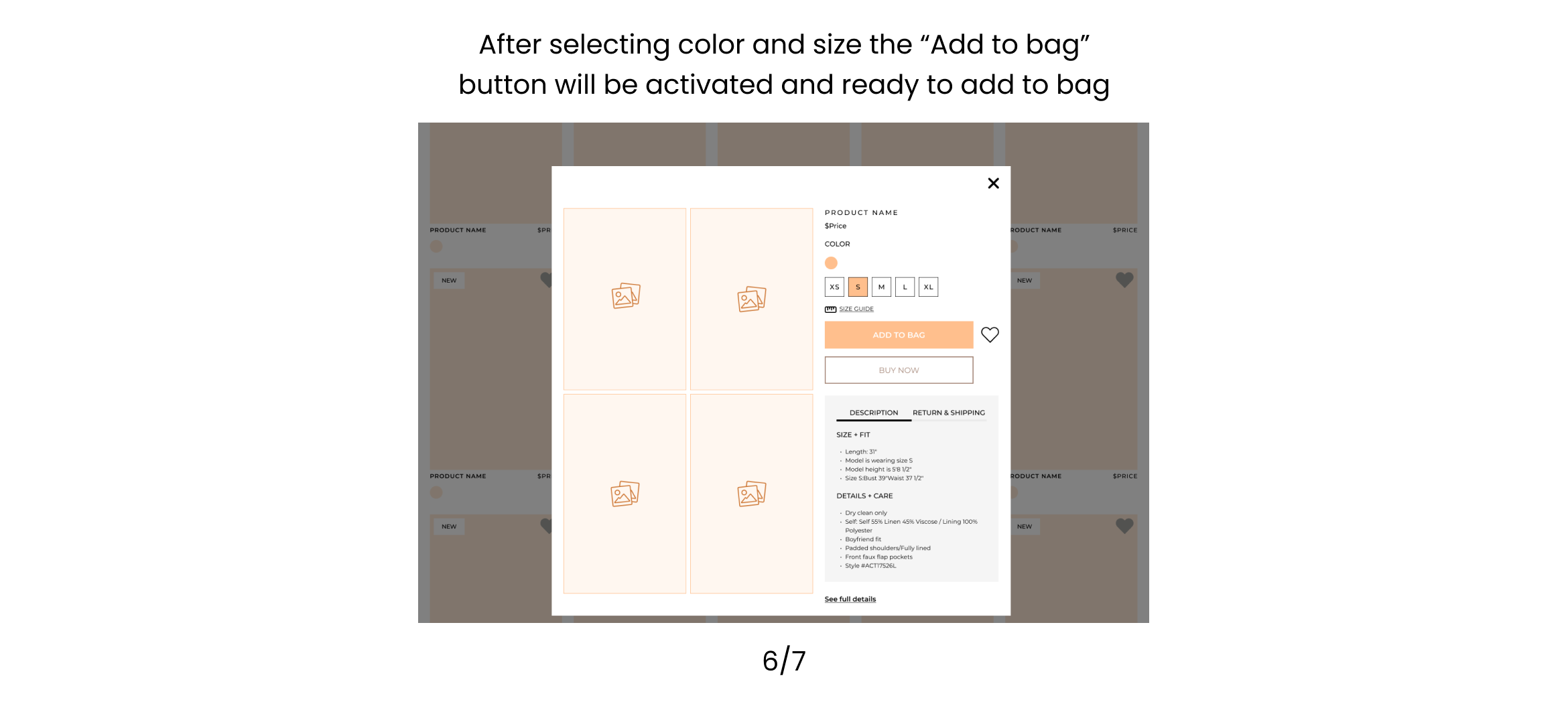
Product tile 1 - Add quick view button on each product tile. After clicking the quick view will pop up.
Product tile 2 - Add quick view button and the add to bag button. When clicking the add to bag button all the sizes will appear and the user can select one size to add to cart. Quick view button will open the pop up and then from there the user also can add to cart.

After reviewing with the team and getting some feedback we decided to go with product tile 1 and just have the quick view button. The quick view will give the same results as the add to bag button and that will be enough for the user to continue shopping within the PLP.
Desktop Userflow


Some improvements were made for the mobile and desktop version.
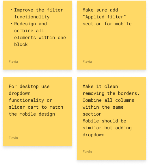
Filter applied added - The user can see which item they selected and it will show on top of the page.
User can deselect the item and also clear all just by clicking on the item selected.
Improvement on the design - Added dropdown for each category and making it easier to look for any category
Filter
Mobile
Desktop


Filter Prototype
Subcategory navigation on PLP
Subcategory navigation enhances the user experience by making it easier to find specific products within a broad category, leading to more efficient and satisfying browsing and shopping experiences.
Users arrive on the product list page via a main category. (Dresses)
A subcategory menu is prominently displayed at the top of the product list.
Users click on a subcategory to filter the product list, narrowing down the selection to more specific types of products. (Maxi Dresses)
The product list updates to display products that belong to the chosen subcategory, allowing users to find relevant items more quickly..
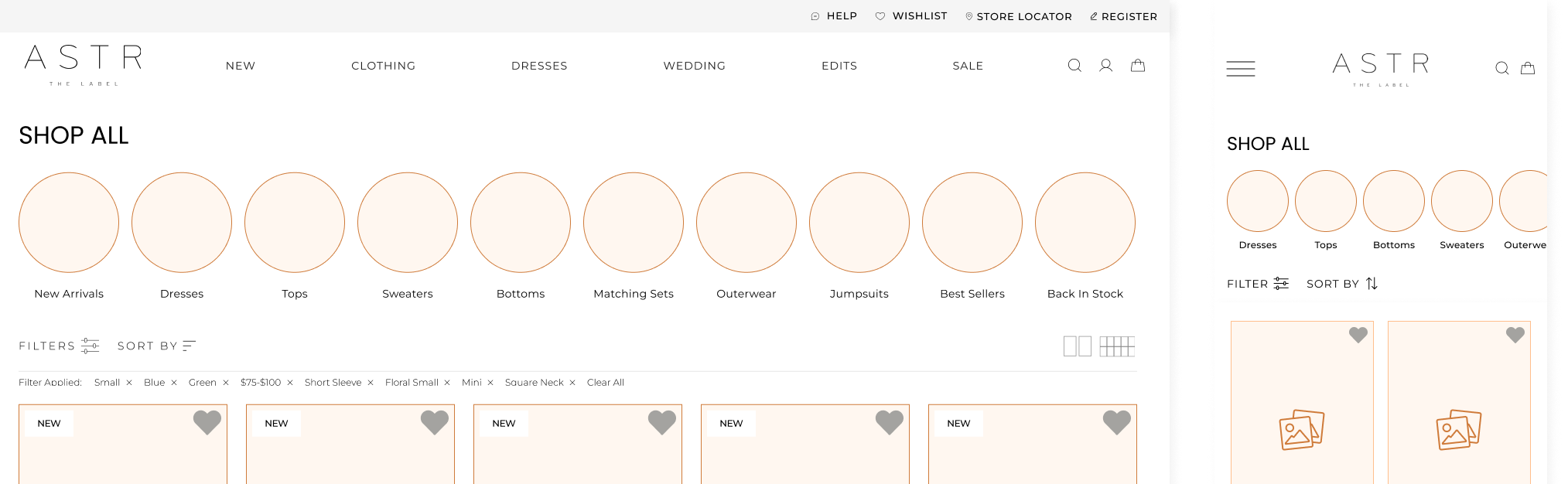
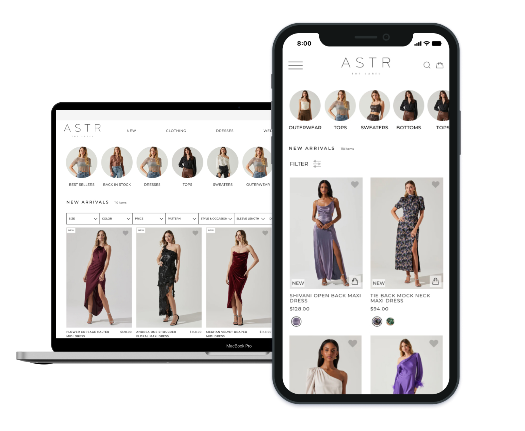
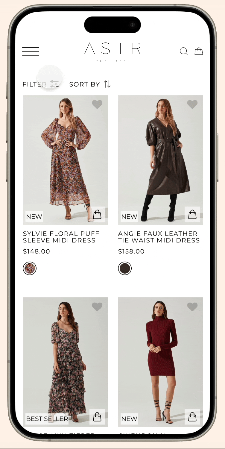
Final screen - Desktop

Final screen - Mobile

Outcome
→ The redesigned product list page was successfully implemented on our site, resulting in measurable improvements in user engagement and conversion rates.
→ Improved navigation efficiency: Users were able to find information more quickly and easily without leaving the page.
→ Enhanced brand perception: The visually appealing design contributed to a positive perception of the brand among users.
Conclusion
The redesign of the product list page was driven by a user-centric approach focused on understanding user needs, iterative design, and continuous improvement. By prioritizing usability, filtering options, and visual design, we were able to create a browsing experience that not only met user expectations but also exceeded them. This case study showcases my skills and expertise in UX/UI design and demonstrates my ability to deliver effective solutions that enhance the overall user experience in e-commerce environments.